From product-attribute-focused to fully-positioned: peek inside an indie cosmetics rebrand...


Inner Beauty Cosmetics
Branding/Creative Direction


Overview
We focused on repositioning the brand as more than just clean beauty (which was a controversial phrase without defined industry safety guidelines). By highlighting texture details and romantic-yet-realistic settings, we created a new brand identity full of depth that celebrates a slower lifestyle.
What we did:
Chose distinctive, story-like serifed typefaces to differentiate from the overwhelmingly mono-slab, sans serif competitive market.
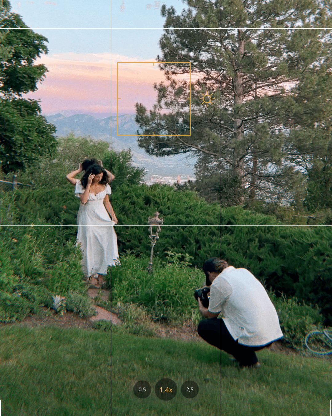
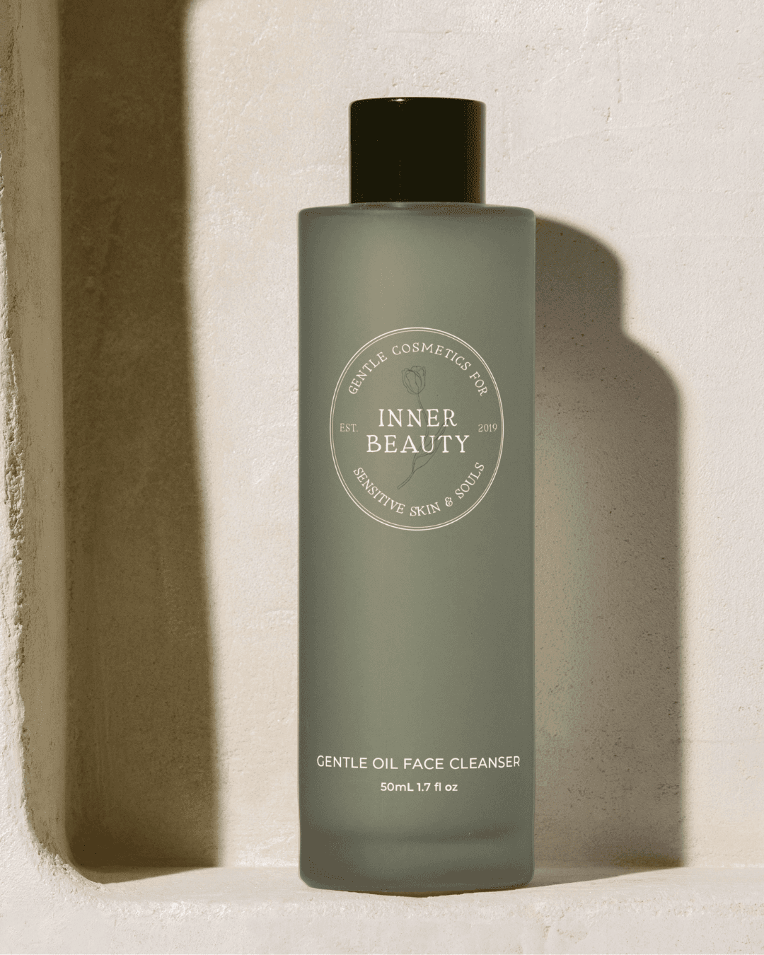
Used close-up detailing, airy action shots, and natural florals to establish an inviting and connected brand essence.
Kept the color palette grounded in earthy neutrals to let intentional color pops shine.
1
Research
Through qualitative and quantitative studies, we found the niche and opportunity in the market that had been overlooked.
2
Positioning
Depth was added to the founder story that gave the brand it's own corner of the market to focus in on and own.
3
Visual Identity
We developed colors, tone, and an asset library that celebrated the ideal customer and stood apart in the clean beauty space.





images © Inner Beauty Cosmetics

